SAN FRANCISCO BASED
•


CODA
Connected Navigation
TOOLS
Figma
Coda
UserTesting
ROLE
Product Design
User Research
Product Management
TEAM
Sam Harper (PM)
Ben Lieber (Eng Lead)
Bianca Lee (Eng)
TIMELINE
Q4 2022
DESCRIPTION
Better looking charts with nicer
CONTEXT
Charting is a core function of the product. Our charts look OK when used at the default size, with one or two series, and with some tinkering of the settings. We want them to look great at all sizes, with all datasets, and with minimal customization. This is our attempt to start on this road.
I worked directly with with our CPO to systematically redesign charting fundamentals so that charts look and feel much better.
Summary & Preview
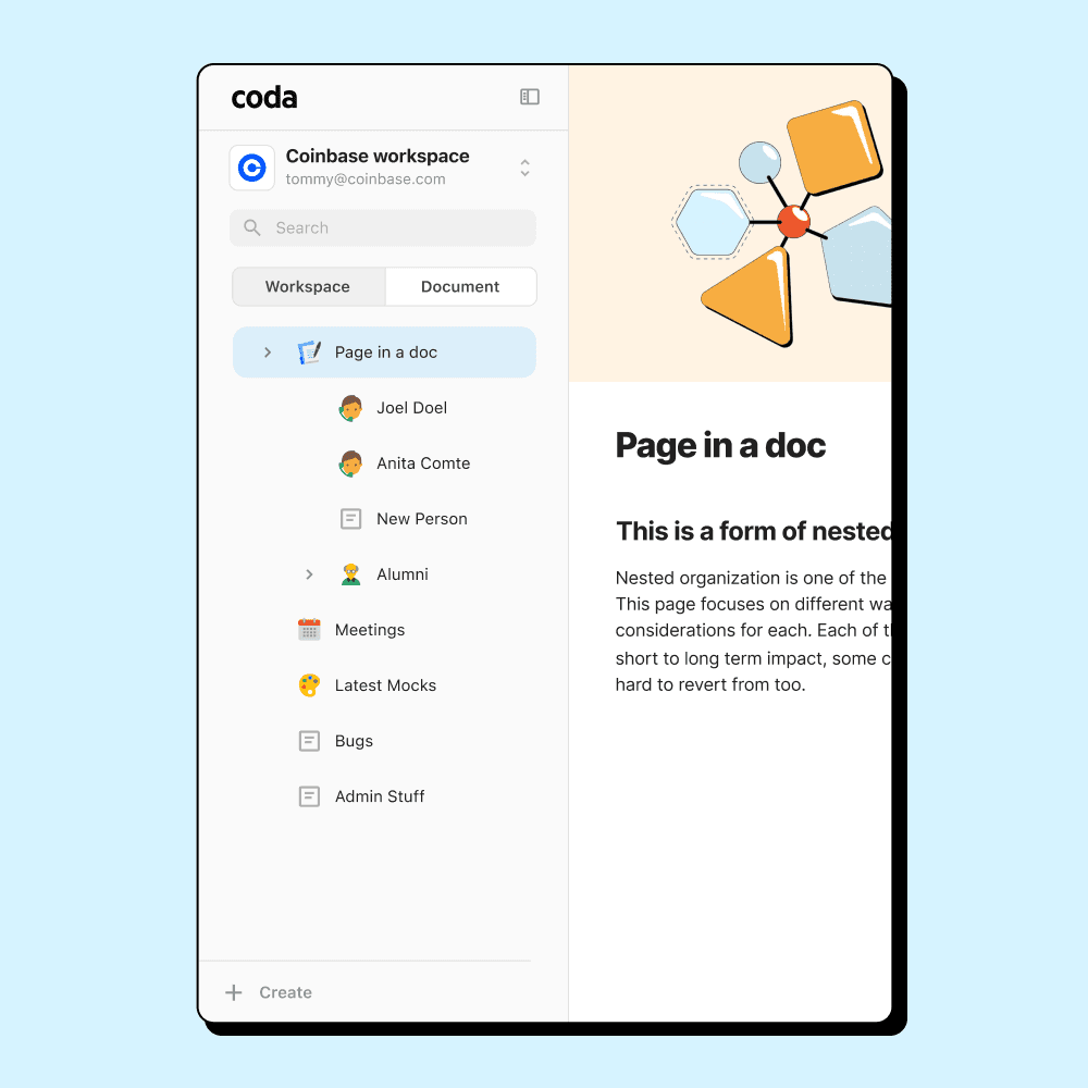
In the past, Coda utilized two separate and disconnected search and navigation systems—one exclusively for the document, and a different one for the workspace.
Switching between these inconvenienced the user. Our team worked towards merging these two approaches to streamline document search and navigation.
Coda's flywheel catalyzes growth
Coda is a collaborative productivity platform that combines documents with database-like functionality. Users have leveraged Coda's powerful composability to replace entire applications and workflows. Anyone can copy and remix docs shared with them and build on top of what others have made for their own use case.
Building docs and sharing and directly or publishing them creates a vibrant ecosystem that encourages more users to find more use cases, leading to more docs built. It's one of our most effective flywheels.
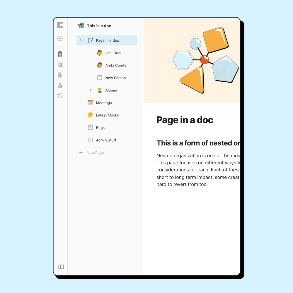
But Coda's old navigation slows growth as workspaces scale
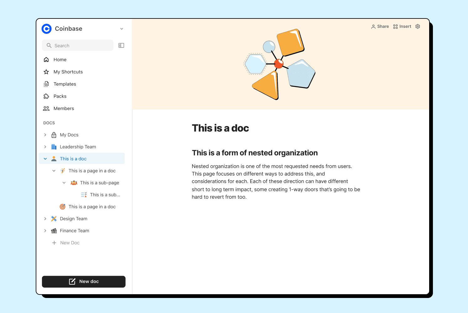
Docs are isolated from other docs
Docs are designed to be self-contained experiences. Users have to leave their current doc to go to another doc. Work tends to intersect across docs so moving between them is a frequent user action.
Switching docs feels heavy
As more documents are added to workspaces, users reported increasing difficulties navigating between them. Docs aren't easily accessible, findable, or discoverable.
Proposals
Users should be able to get to any other doc from their current doc
Doc makers and contributors just want to quickly find and access the documents they're working in. They shouldn't have to switch to an entirely different interface to get to other docs. They should be able to jump to other docs from the doc they're in.
Users shouldn't have to deal with navigation layers most of the time
Coda has many layers of workspace organization. Many of these layers are designed for top-down organization by admins and managers. The average Coda user doesn't need to engage with all of these paradigms. They shouldn't have to see these paradigms unless they need them.
Constraints
Avoid adding complexity to learning Coda
Coda is a hard tool to learn—a complex interaction could turn off new users. The solution must not increase the complexity of learning Coda for new users, or add to the perception that Coda is a complicated tool.
Keep the UI focused on the document
Users should remain engaged with their document. Any additional UI elements must be subtle and avoid distracting users from working on their documents. It must not make navigating the pages within a document more difficult. The page list should remain the primary navigation element.
Research
Interviews and feedback review
We had over 85 recorded mentions of navigation issues over the years. I went through and synthesized all recorded instances across Product, Sales, and Customer Support.
Even with all that feedback, we still had open questions to ask. I leveraged our sales team to find and schedule interviews with 8 growing accounts. Half of the accounts directly mentioned issues with navigation. These accounts ranged between 10 users to 500 users in account size.
Leveraging our teams to spark exploration
To start with the widest the range of potential solutions (and because navigation touched so many parts of the app so getting everyone onboard was important), my PM and I conducted a 1-day design sprint with the entire product team, followed by a 3-day sprint with our core team.
We generated ideas, prototyped the top contenders, and ran both internal and external user testing to figure out what worked best.
Explorations
Unified navigation
We started with a unified navigation system that combined workspace and doc-level navigation, allowing access to all organizational levels through one sidebar.
However, testing revealed this approach felt complex, especially in larger workspaces. This approach also took away from the focus on the doc. I led the decision to pivot away from this approach based on the complexity it added to the UI.
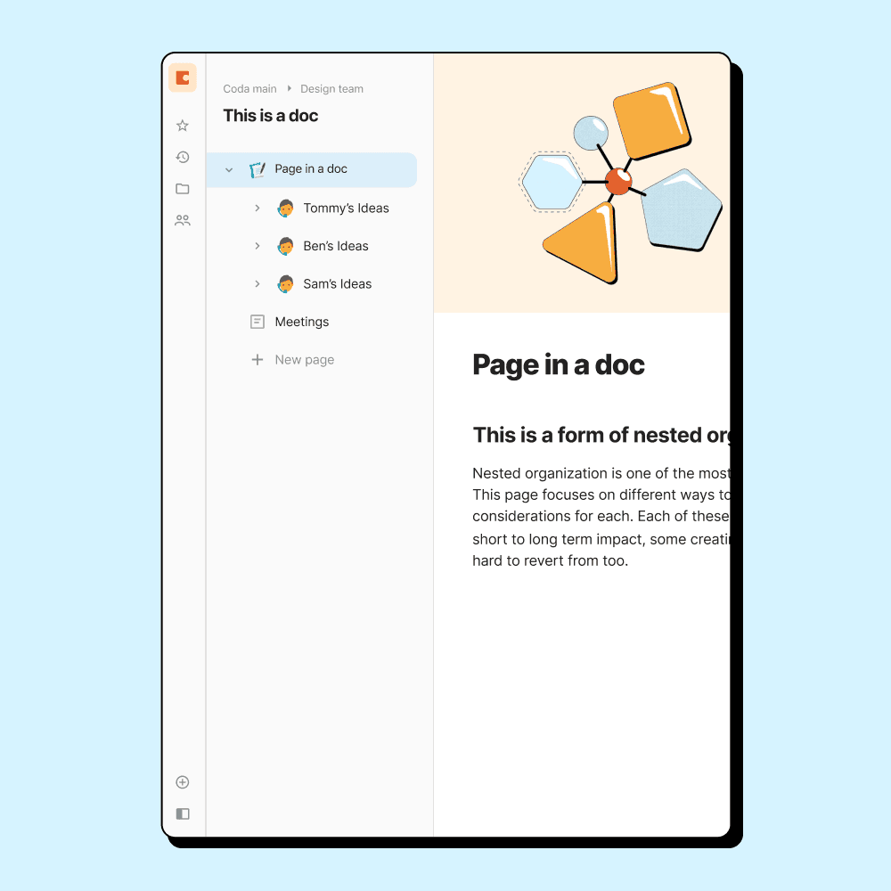
Separate but connected navigation
I re-focused on keeping the doc's page list and the workspace in separate views, but ensuring the workspace navigation was readily accessible within the doc.
Dogfooding (testing internally)
To truly test our design, we created an MVP and had Coda employees use it daily. This real-world testing provided invaluable feedback, allowing us to iterate rapidly. I led weekly feedback sessions and reviewed incoming feedback, making iterative improvements to the design based on their experiences.
Launch
Simple and accessible interaction model
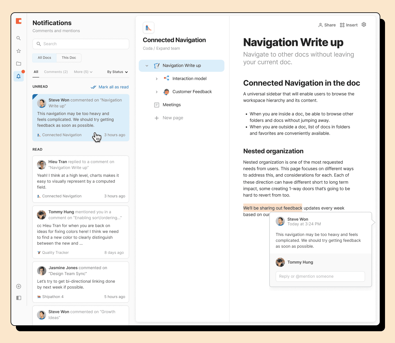
Connected Navigation manifests as a mini-sidebar in a doc, taking up the least amount of space and attention while still holding presence. When you open it, it visually implies that you're looking "outside" the doc. It's easy to unpin it hide it when you don't want to see it.
Users can access all docs across their workspaces without leaving the doc, their personal shortcuts, and any folders they have access to. Every other layer of organization is abstracted from Quick Nav so users can focus on moving fast.
Notifications Inbox
We relocated notifications into Quick Nav, reframing them as an active inbox.
Though the core functionality remained the same, this shift in mental model led to increased notification engagement. Users found the new placement to be more integrated in their daily workflow.
Search within or across docs
In the previous design, we had two separate search functions: one for finding content within the current document, and another for finding documents across the workspace.
To search across the workspace for documents, a user had to leave the doc and go back to the workspace.
I integrated cross-document search directly into the document-level search, letting users search for everything without leaving the doc.
Impact
Reflections
Cross-disciplinary teamwork
I really enjoyed my working relationship on this project. I worked shoulder-to-shoulder with my PM and engineers. We often moved across roles. I found myself making code prototypes or fleshing out the PRD. My PM would jump into Figma and riff off my ideas, and my engineers would make improvements on the designs in code. It felt like our team was firing on all cylinders together, trying to prove our thesis to the rest of the company.
Practical over perfect
In collaborative workspaces, navigation isn't just a feature—it's the thread that connects multiple areas of the app owned by different teams, leading to very involved stakeholders.
While we spent countless hours debating the "ideal" organizational structure with sub-folders, tagging systems, and user group hierarchies, what actually moved the needle was simply making navigation easy to reach and not overwhelming.
Rather than trying to achieve consensus, we focused on getting something tangible that people could react to and provide real feedback on, which ultimately proved more productive than endless cross-team negotiations.
There isn't a perfect organizational structure for collaborative workspaces.
Collaborative workspaces inherently hold a tension between organizers (gardeners) and those who seek out content (foragers) in an collaborative workspace. This is because admins and managers are driven to create top-down organization as a way to manage access and individual contributors are driven to jump through the least hoops possible to get their work done. Things will get messy as as workspaces scale.
This improvement to navigation was an important but limited stepping stone. I believe any UI-driven changes to navigation can only go so far.
The real opportunity is leveraging AI for context-aware and semantic search. This will help foragers find the right things without relying on workspace organization. Coda recently made a significant step by launching Coda Brain, a way to search across Coda and many other work tools with AI. This will likely become the standard for collaborative workspaces in the future.