SAN FRANCISCO BASED
•


EQUALS
Data Integrations
TOOLS
Figma
Notion
UserTesting
ROLE
User Research
Product Design
Product Management
TEAM
Ben McRedmond (CPO)
Calvin Collins (Eng)
Maddie Revill (Eng)
TIMELINE
Q2 2023
DESCRIPTION
An overhaul of data integrations to support deep querying, reports, and data transformations paired with usability improvements to bring first-class integrations to Equals.
CONTEXT
Equals is all about enabling individuals to extract data from their business software, analyze it, and produce reports with it. Integrations are a fundamental aspect of Equals.
When I first joined, we were seeing a 60% churn rate from new users. Early feedback indicated that the quality of our integrations was at least partly responsible.
I spearheaded research that informed our integrations overhaul, designed the UI for the overhaul, and drove new feature development based on the research.
🏗️ CASE STUDY WORK IN PROGRESS 🏗️
Equals enables access to business data through integrations
Equals is a powerful data analysis tool that aims to make business data accessible to any knowledge worker that knows how to use a spreadsheet through it's integrations with tools like Stripe, Salesforce, Hubspot, and Google Analytics. Technical and non-technical users alike can use Equals to query data from their tools, analyze it in a spreadsheet, and send out reports to review.
But our integrations were not meeting expectations
High churn rate for new users
A significant portion of users were churning after connecting their first data source and attempting to query data—a critical step in onboarding. This points to, among other things, issues with the usefulness of our integrations.
High support ticket volume
A significant number of support questions revolved around how to query data, limitations of what can be queried, and when we would work on improving our existing integrations.
Research
Phase 1: develop a baseline
I summarized our team’s collective knowledge, distilled it into a series of questions, and spoke with 12 users who had stopped using our integrations to establish a baseline understanding. To complement the qualitative findings, I also distributed a survey and analyzed our product analytics.
Phase 2: deep dive
After evaluating our baseline, I conducted ten field studies with users who remained frustrated while using the integrations. The research process took a total of two weeks, during which our team discussed feedback as it was received.
Insights
Integrations did not expose enough data
Our integrations fell significantly short of user expectations. Users desired greater depth, including out-of-the-box dimensions and support for custom object types. While we were aware of some of these shortcomings, achieving parity would require considerably more time and resources.
As one user aptly described it, "Right now, Equals is just a toy and I'm dead in the water".
The right data can be hard to find
Users needed to understand how data was structured in their data sources to query effectively. This was true for technical users writing SQL, but it was especially challenging for non-technical users using the query builder. Often, users would assume they couldn’t extract the data and give up.
Raw data limits what analysts can do
Immediate improvements
Transition to a third-party integration platform
The effort required to enhance our integrations was significant. While our integrations were crucial to our product offering, they were not our main focus. Instead of spending multiple cycles reinventing the wheel, we chose to transition to Fivetran as a vendor for many of our integrations, leveraging their extensive library of data connectors.

Improve the usability of the query builder
Based on my research, I identified two major challenges with the query builder for non-technical users that hinder their ability to find the right data.
Ongoing Improvements
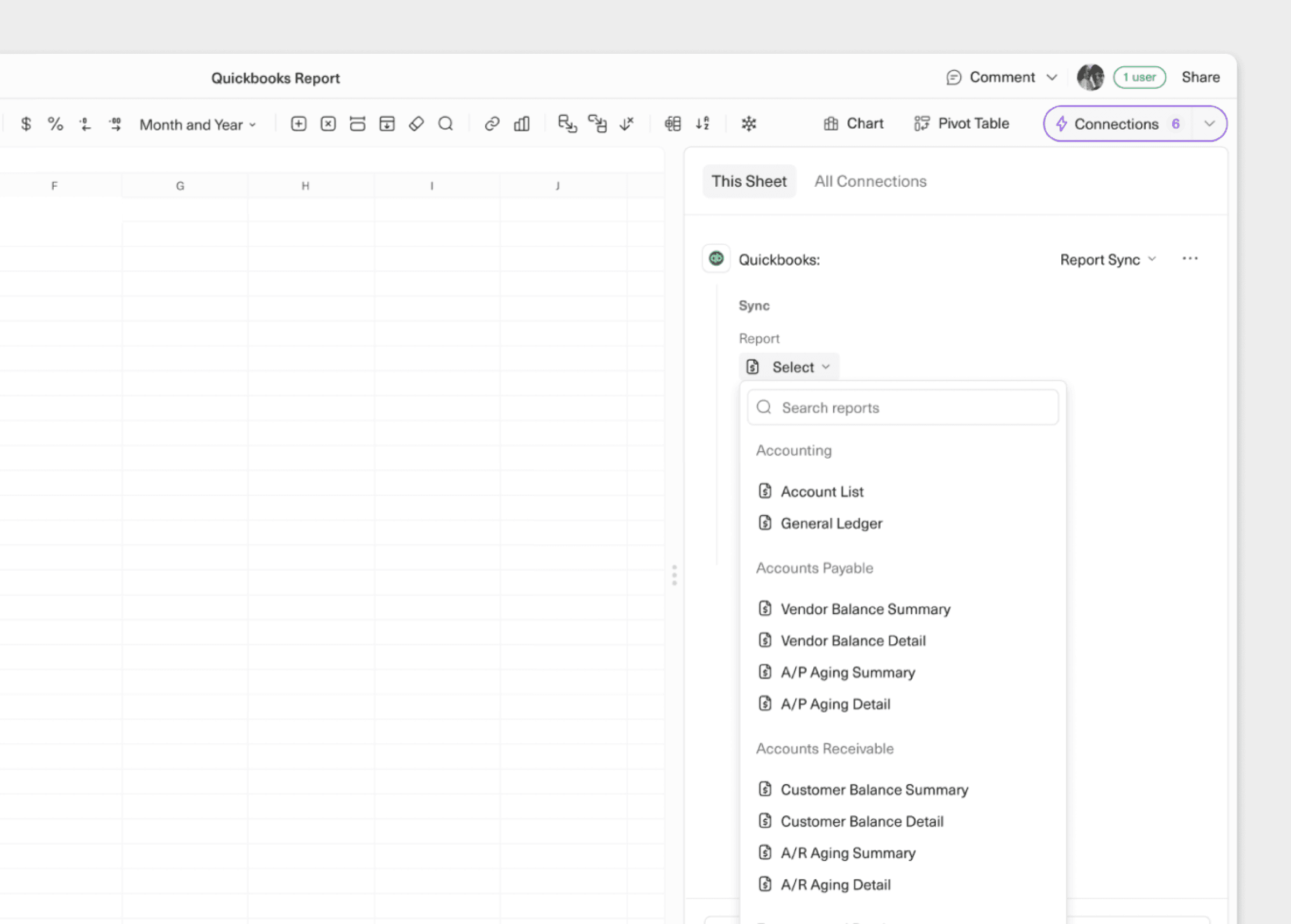
Report Sync
I designed a new panel to sync reports from our QuickBooks and NetSuite integrations. This feature allows users to import prebuilt reports from QuickBooks and NetSuite. The reports are already cleaned and formatted, enabling users quick access their Profit and Loss statements or General Ledger.
Data views
Data views represent Equals' initial step in empowering users to programmatically transform data directly within the platform, eliminating the need for a separate data warehouse or data pipeline. This transition advances Equals from being merely a data retrieval tool to a ETL solution, where data is processed and ready for analysis.
Start with a Blueprint
We relocated notifications into Quick Nav, reframing them as an active inbox.
Though the core functionality remained the same, this shift in mental model led to increased notification engagement. Users found the new placement to be more integrated in their daily workflow.
Edit view with SQL
In the previous design, we had two separate search functions: one for finding content within the current document, and another for finding documents across the workspace.
To search across the workspace for documents, a user had to leave the doc and go back to the workspace.
I integrated cross-document search directly into the document-level search, letting users search for everything without leaving the doc.
Impact
Reflections
Cross-disciplinary teamwork
I really enjoyed my working relationship on this project. I worked shoulder-to-shoulder with my PM and engineers. We often moved across roles. I found myself making code prototypes or fleshing out the PRD. My PM would jump into Figma and riff off my ideas, and my engineers would make improvements on the designs in code. It felt like our team was firing on all cylinders together, trying to prove our thesis to the rest of the company.
Practical over perfect
In collaborative workspaces, navigation isn't just a feature—it's the thread that connects multiple areas of the app owned by different teams, leading to very involved stakeholders.
While we spent countless hours debating the "ideal" organizational structure with sub-folders, tagging systems, and user group hierarchies, what actually moved the needle was simply making navigation easy to reach and not overwhelming.
Rather than trying to achieve consensus, we focused on getting something tangible that people could react to and provide real feedback on, which ultimately proved more productive than endless cross-team negotiations.
There isn't a perfect organizational structure for collaborative workspaces.
Collaborative workspaces inherently hold a tension between organizers (gardeners) and those who seek out content (foragers) in an collaborative workspace. This is because admins and managers are driven to create top-down organization as a way to manage access and individual contributors are driven to jump through the least hoops possible to get their work done. Things will get messy as as workspaces scale.
This improvement to navigation was an important but limited stepping stone. I believe any UI-driven changes to navigation can only go so far.
The real opportunity is leveraging AI for context-aware and semantic search. This will help foragers find the right things without relying on workspace organization. Coda recently made a significant step by launching Coda Brain, a way to search across Coda and many other work tools with AI. This will likely become the standard for collaborative workspaces in the future.